Building a Better Experience for NIH Grants Applicants
CLIENT:
National Institutes of Health/Office of Extramural Research
PROJECT:
https://grants.nih.gov/grants/policy/nihgps/HTML5/introduction.htm
Challenge
For more than twenty years, the Grants Policy Statement (GPS) has impacted every National Institutes of Health (NIH) grant applicant, as a grantee must agree to comply with GPS requirements as a condition of award. The GPS website is thus one of NIH’s most helpful and important tools for educating grantees on policies, compliance and more. By 2018, however, the GPS website had fallen behind usability standards and wasn’t organized intuitively so that users could find the information they needed. Acting on feedback from our ongoing work within NIH, Ripple Effect recommended updates to the GPS site to enhance site navigation, revamp the search functionality, and build a simpler, more accessible user experience.
Strategic Solution
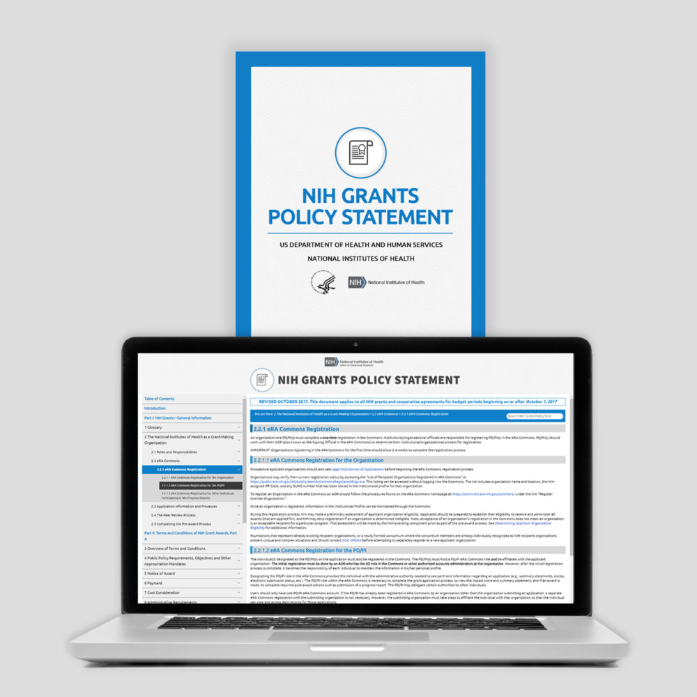
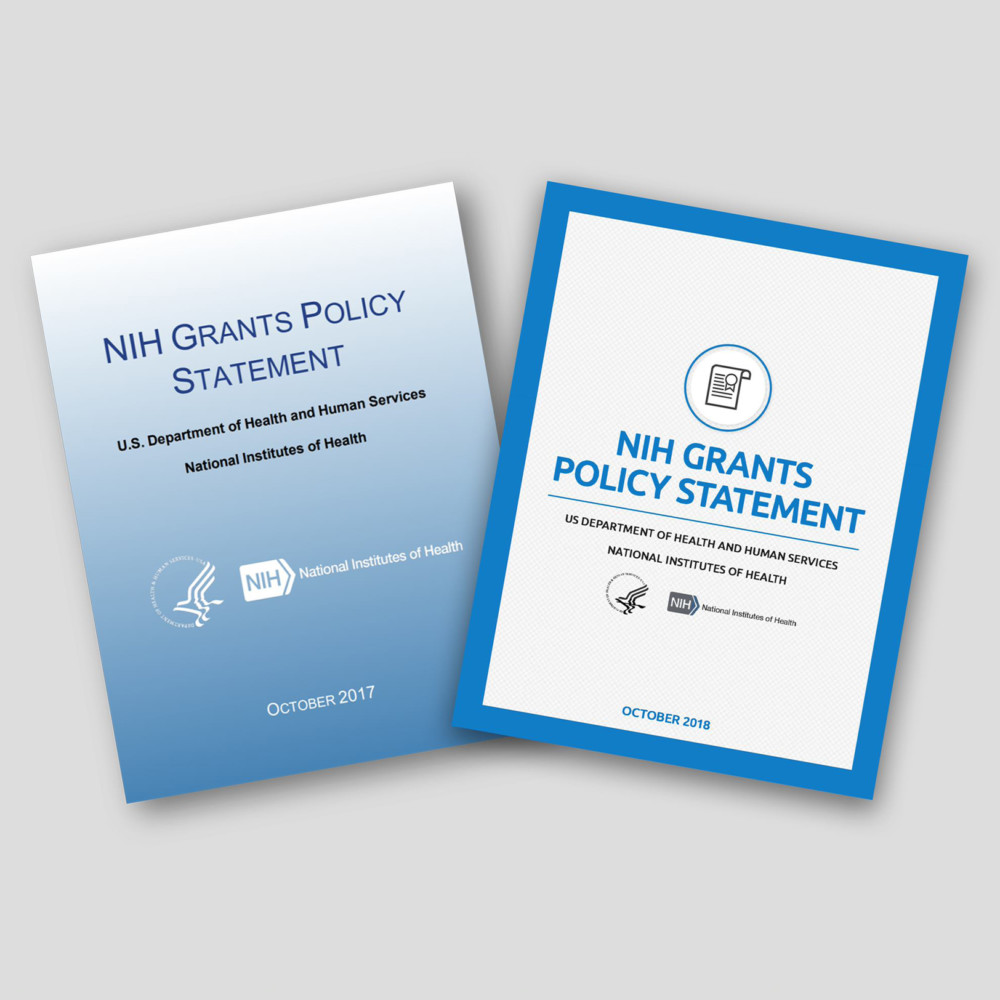
GPS content is updated annually to keep pace with constantly evolving grants policy. Needing to improve the site and account for these annual updates, Ripple Effect’s grant policy experts reviewed all 400 pages of the GPS document to identify areas of improvement, and worked with our graphic design team to create a modern look and style guide, from heading designs to table styles and color schemes. Our team improved the navigation pane, and added an on-page glossary function for users to reference when they encounter unfamiliar terms. We wrote new headers that allowed grantees to more easily navigate the GPS, helped internal NIH staff to answer questions more quickly, and optimized all content within the document for discoverability.
Impact
NIH debuted its refreshed GPS site in 2018, featuring more vibrant, easy-to-read content, a more user-friendly interface, and simpler navigation. Users can now expand and collapse the navigation menu and bookmark their place within the document, allowing them to move through the guide more easily without having to backtrack. The enhanced search capabilities led to more relevant links appearing in search results, accompanied by helpful descriptions of each section’s content. Together, these GPS webpage improvements led to more relevant search results for users, cut down on the time grant applicants spent searching through the site, and created a lasting format that has been maintained by NIH with each set of annual policy updates.


